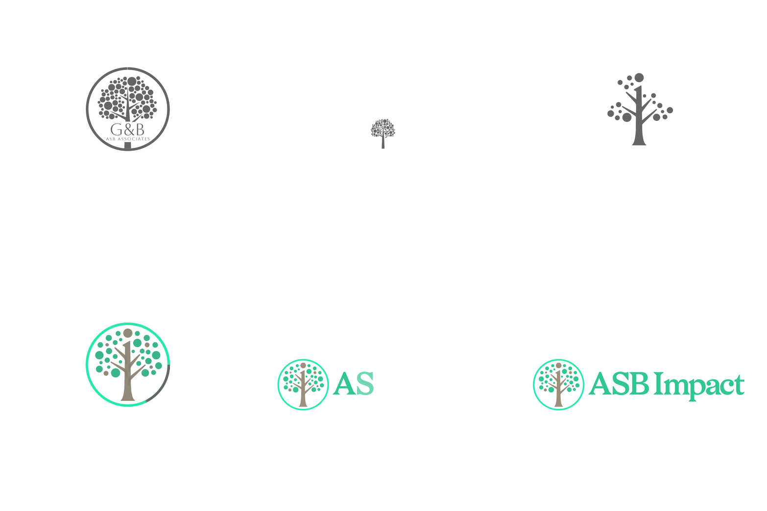
The Living Tree Concept
Welcome back, Janine.
Before we move forward...I'd like to ask you something.
When a tree grows...Does it become a different tree?
Or does it simply become a better version of itself?
When we first met, you said something that quietly guided every decision we made.
You didn't want to become a completely different organisation.
You wanted the same people.The same values.The same commitment.
Expressed more clearly. Those words planted the seed for this first creative direction.
Honouring Your Roots
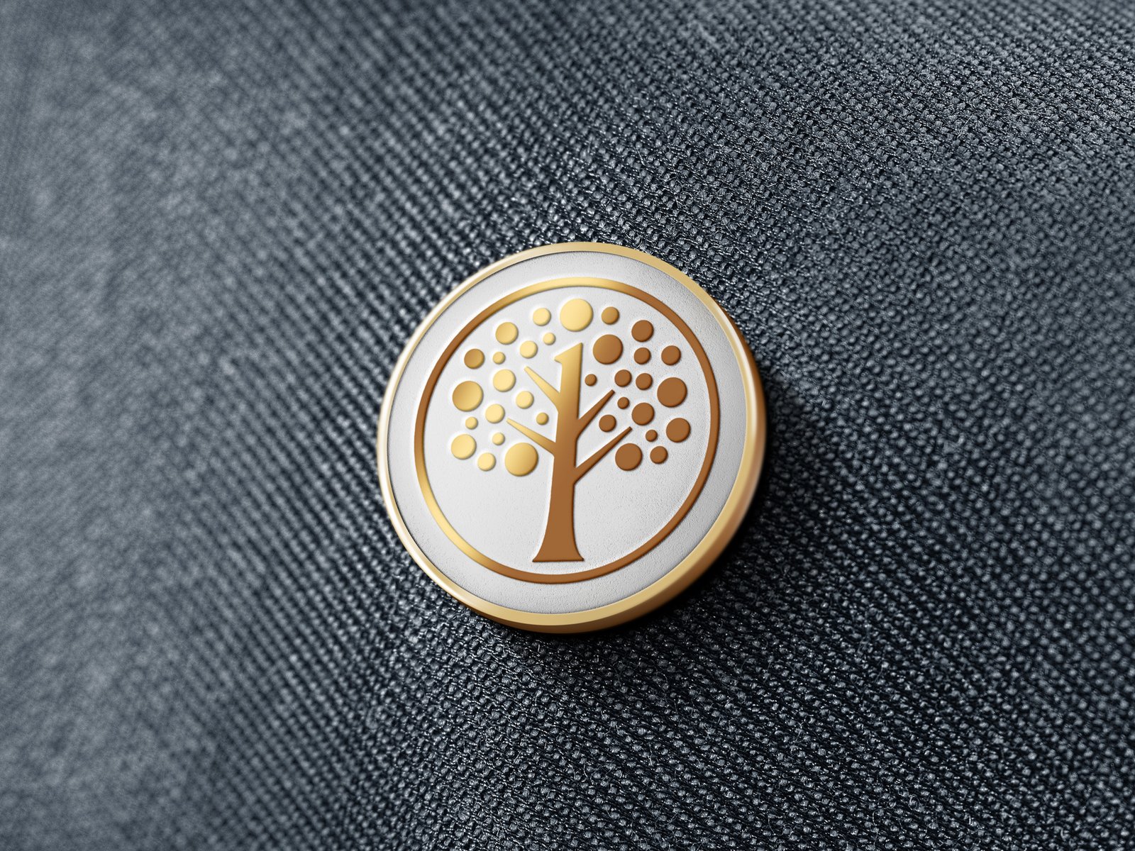
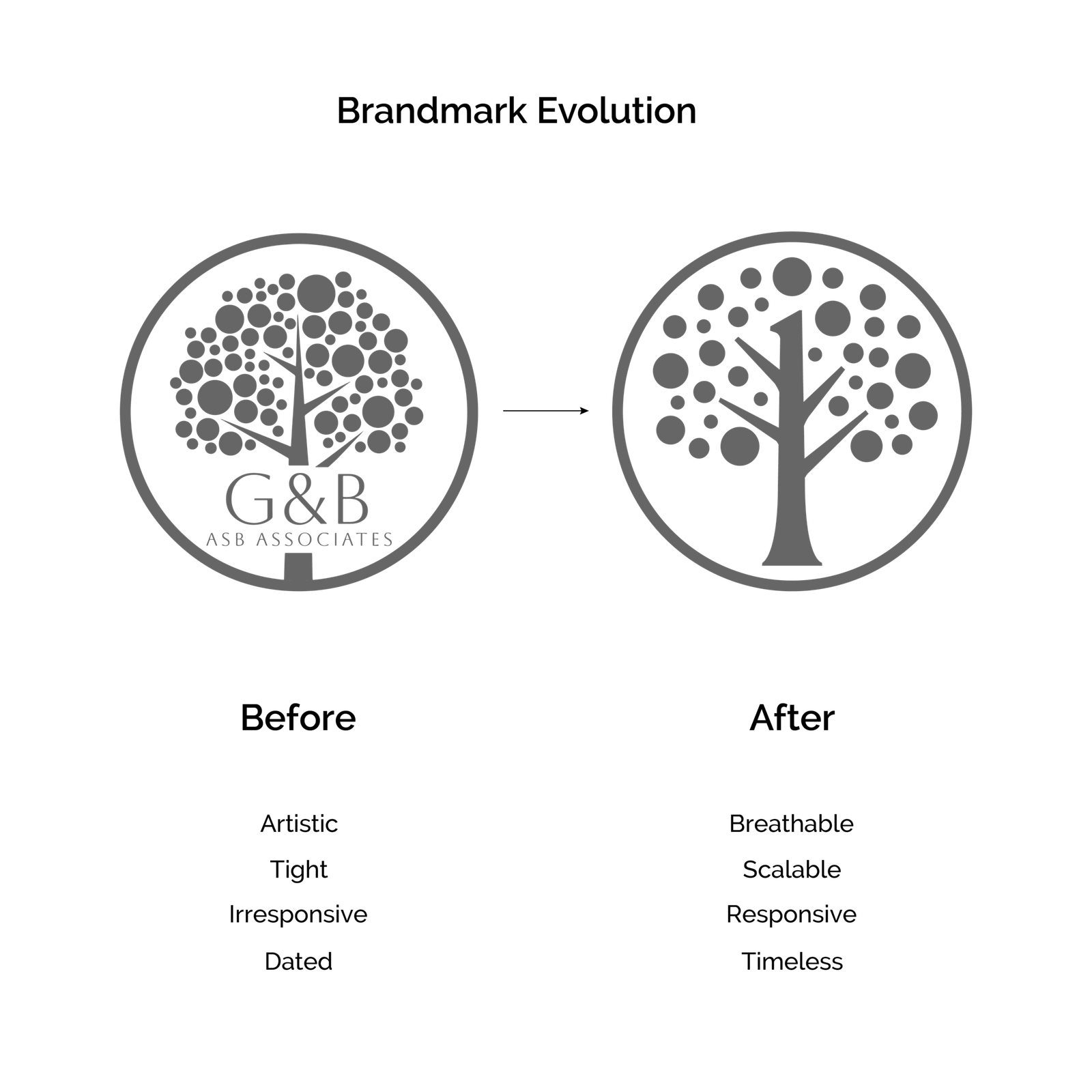
Your previous identity already carried something valuable. The tree. Rather than replacing it...We asked ourselves a different question."What if the tree simply grew? "The result is a cleaner, stronger and more timeless symbol.Not a new beginning. An evolution.
Hidden in Plain Sight
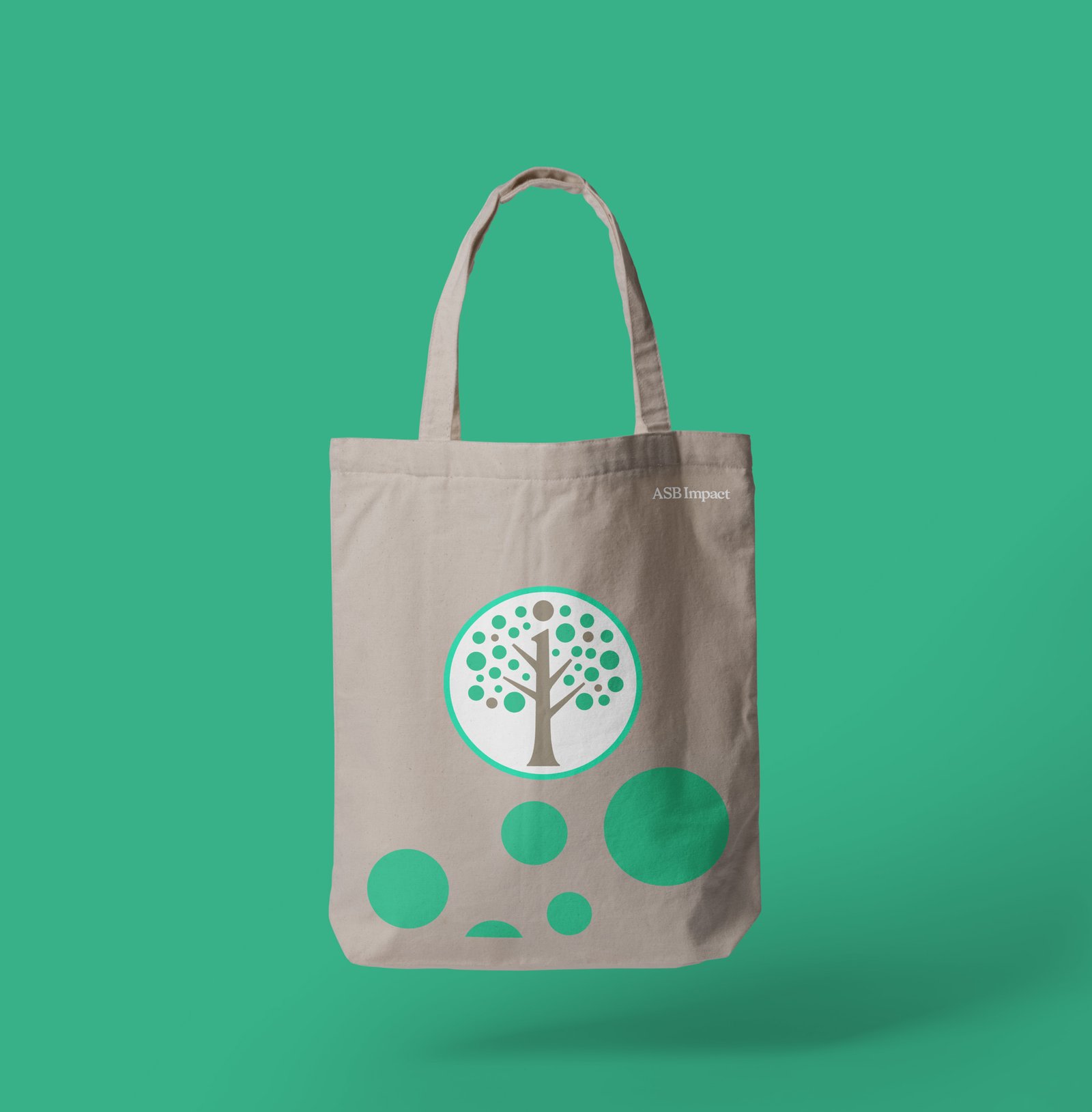
Take another look at the centre. Do you notice something? Hidden within the trunk is a lowercase serif i. A small detail. Easy to miss. Impossible to forget once you've seen it. It quietly represents Impact. But it also represents Individuals. Because organisations don't create change. People do.
Four Branches
The original tree contained four primary branches. We've carefully preserved them. Not because the number itself carries meaning...But because continuity builds trust. They now represent four qualities we repeatedly discovered throughout this project. Expertise.Partnership.Confidence.Growth. Together they support every outcome your organisation creates.
The Circular Forms
In the previous identity, the circles were leaves. In this evolved symbol, their role has changed. Some people may see fruit. Some may see people. Others may see communities.
We see something even more meaningful.
Outcomes.
Every conversation. Every policy review. Every training programme. Every piece of consultancy. Should eventually become something that improves another person's life. That is why the circles remain.
The Circle That Holds Everything Together
Surrounding the tree is the original enclosing circle.
We chose to preserve it.
Because your work doesn't exist in isolation. It brings together housing providers.
Police.Local authorities.Community safety teams.Partners.Victims.Communities.
One shared purpose.
One complete system.
Typography
A meaningful identity should invite discovery, but its name should never need to be discovered.
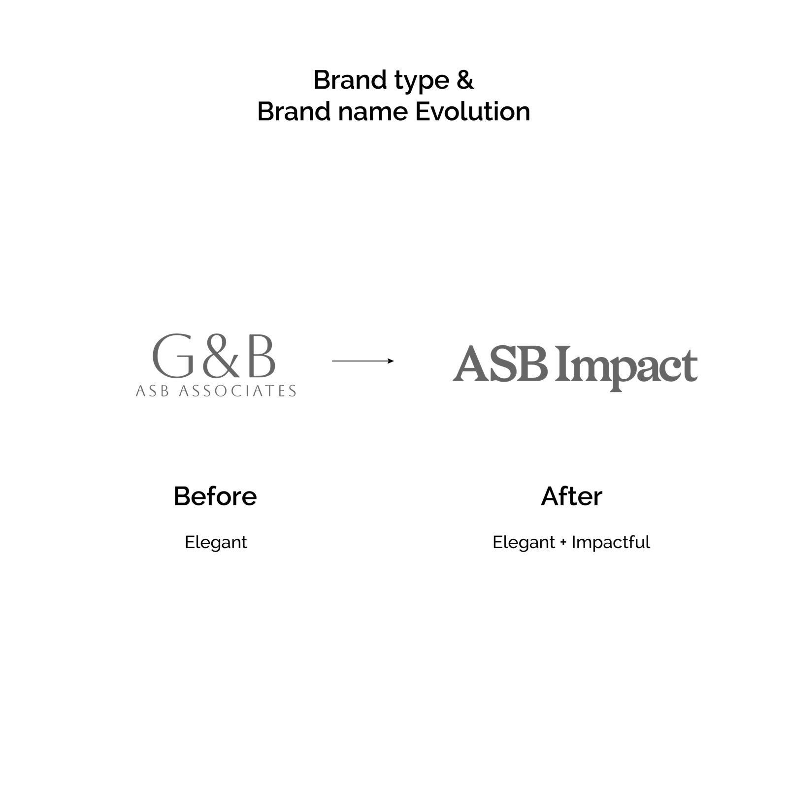
The original ASBimpact lockup created a close visual relationship between the two words, reinforcing the idea of ASB and Impact belonging to one connected identity. However, that closeness also introduced a moment of ambiguity: at certain sizes or at a quick glance, the lowercase “i” could become visually absorbed into the word, momentarily interrupting the natural reading of the name.
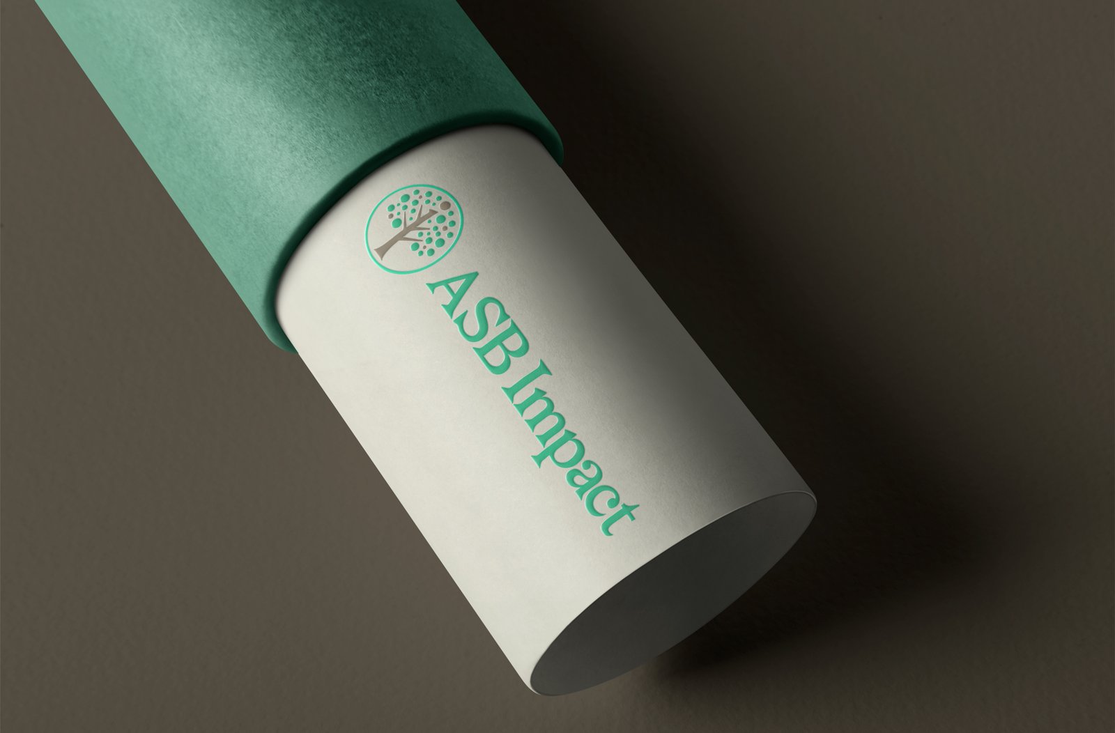
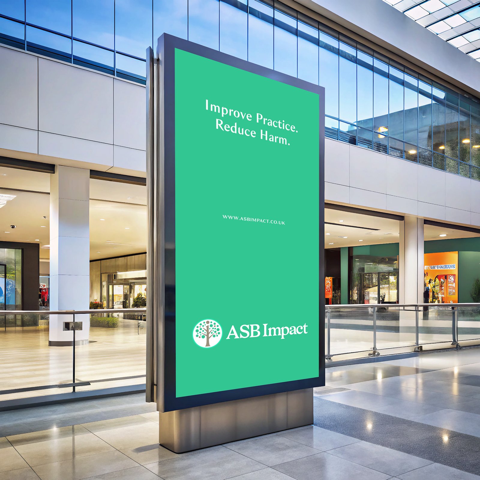
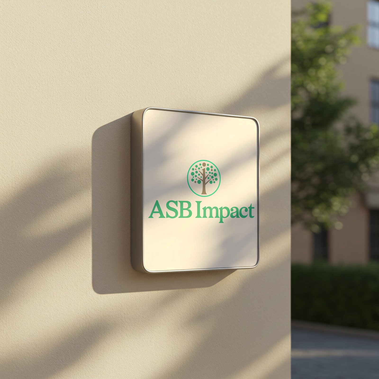
The refinement to ASB Impact solves this in the simplest and most purposeful way. By giving ASB and Impact their own space, the eye understands the name immediately. There is no decoding, no hesitation and no unnecessary visual effort — an important consideration for an identity that must work effortlessly across websites, reports, training materials, presentations, social media, event environments and small-scale applications. But the space between the words does more than improve legibility. It gives each word room to carry its own meaning.
ASB defines the expertise.Impact defines the purpose. One tells us what ASB Impact understands deeply; the other tells us why that expertise exists. Together, they express the organisation in its simplest form: ASB → Impact
Specialist knowledge transformed into meaningful outcomes.
This clearer separation also allows the hidden lowercase “i” within the tree to perform its role more effectively. The wordmark no longer needs to carry that visual idea itself. Instead, typography does what typography should do — communicate the name effortlessly — while the symbol rewards a closer look with the hidden “i” for Impact.
This creates an important hierarchy within the identity:Read first. Discover second. Remember afterwards.
The typography provides clarity. The tree provides meaning. And together, they create an identity that can be understood in an instant — yet still offers something deeper to those who take the time to look.


Colour
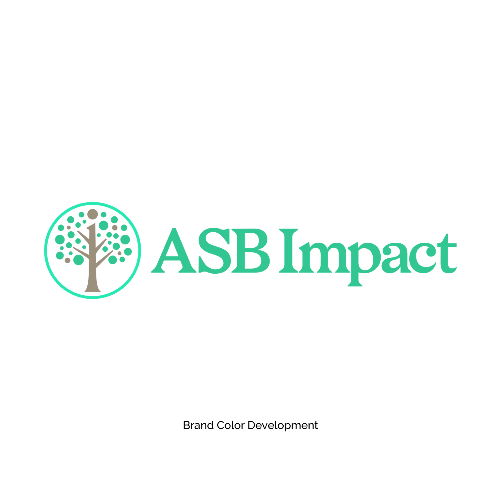
Variation 4 — Positive Energy & Progress
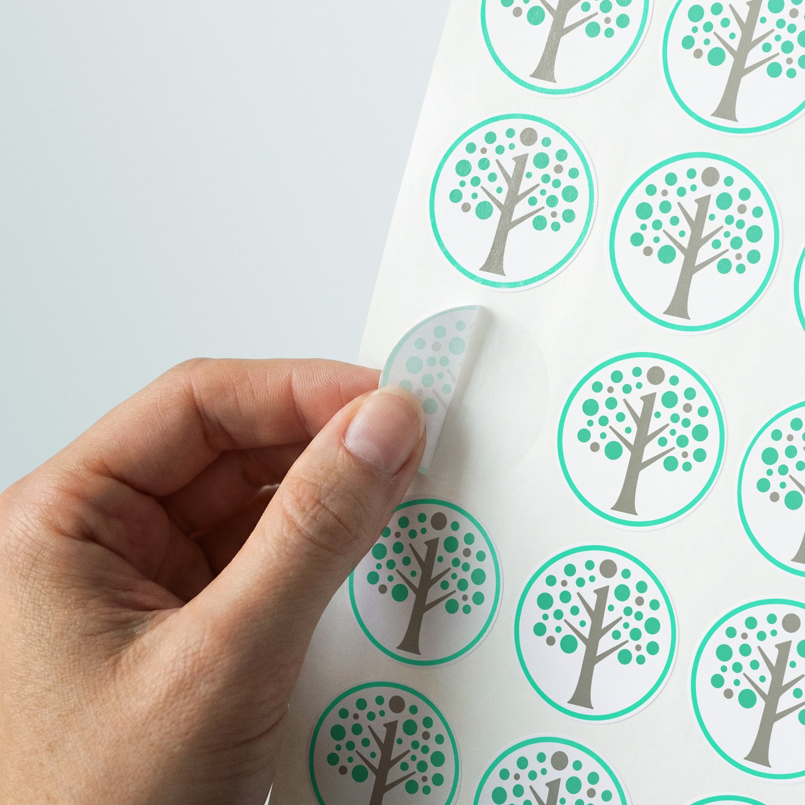
Tree / Impact “i”: #9B907C
Green Fruits: #32C692
Outer Ring: #27E8B2
Variation 4 takes the Living Tree into its freshest and most progressive expression.
The brighter green fruits immediately bring greater energy and vitality to the identity.
They make the idea of positive outcomes feel more visible — almost as though the tree is actively producing new growth.The brighter outer ring pushes this idea further.
Rather than simply containing the tree, it creates a sense of optimism, momentum and positive energy surrounding the entire organisation.
This makes Variation 4 particularly relevant to the word Impact.
ASB Impact does not exist simply to provide consultancy, deliver training or produce policies. Its work is intended to create something beyond the intervention itself: more confident professionals, better practice, stronger systems and ultimately reduced harm within communities.
The brighter greens help visually communicate that forward movement.At the same time, the warm #9B907C remains within the tree and hidden “i”, grounding this energetic palette in experience and stability.
This creates an intentional contrast:
The foundation is established.
The impact is alive.
The organisation's experience forms the roots, while its positive outcomes represent the new growth.
Variation 4 therefore feels the most optimistic and future-facing of the three — an expression of an established organisation entering a new chapter with renewed energy, clarity and purpose.

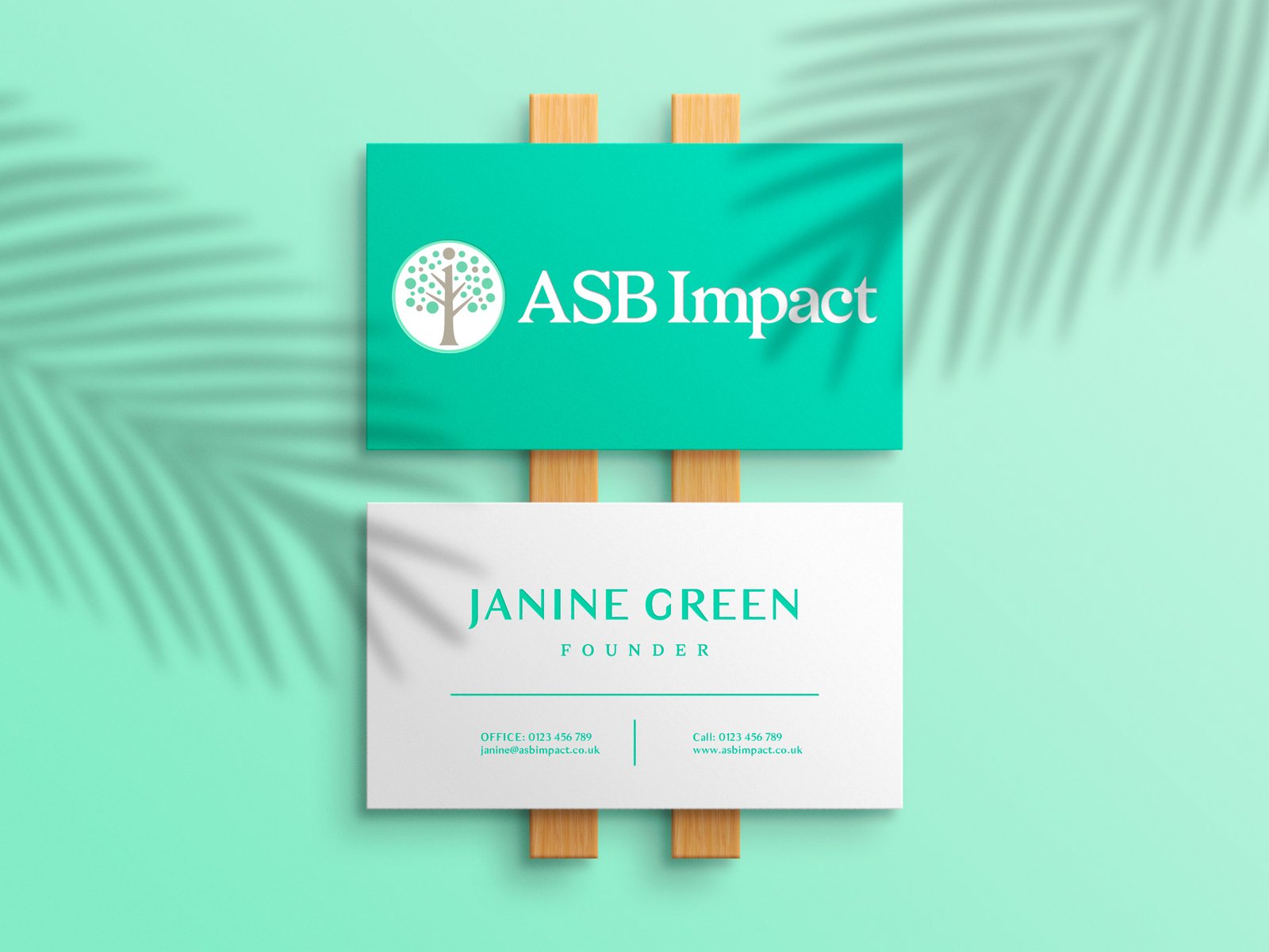
“&&&& Here’s Variation Four !